Choose a cart drawer, page or hybrid from the buyer’s review and editing tasks. A drawer may preserve browsing context; a full page may give a complex order more room. Neither is accepted until quantities, totals, personalization, selling plans and recovery stay correct on the routes customers actually use.
A compact drawer can work for a simple replenishment purchase yet become difficult to review when one order contains a subscription, two differently personalized items and a delivery note. A spacious cart page can also fail if its quantity controls change the wrong line.
I recommend comparing the same realistic basket and the same required tasks in both surfaces. Approve the design that makes those tasks understandable and reliable on desktop, mobile and keyboard. A general conversion claim about drawers cannot make that decision for your store.
Put it into practice
Theme change and launch QA pack
Preserve behavior through a theme change, compare expected and observed results, and plan recovery across shared dependencies.
Explore this resourceList what buyers must confirm before checkout
Bring one ordinary basket and one deliberately complex basket from the store’s actual product types. List the information a buyer needs to review: exact variants, component contents, per-item personalization, purchase interval, quantities, accepted prices/discounts, notes and any verified delivery message. Keep private customer records out of the example.
Record the actual theme/version, cart or upsell apps, payment-entry buttons and custom cart updates. Identify which system owns each amount and message. The cart should display an accepted commercial result, not recalculate a promotion differently from checkout.
| Buyer task | Required evidence | What a screenshot cannot prove |
|---|---|---|
| Confirm the exact items | Variant and item-specific summary remain visible | Correct identifiers were submitted |
| Edit or remove one line | Only the intended line changes | A matching-looking card maps to that line |
| Understand the purchase commitment | One-time/recurring choice and relevant terms stay clear | The selling plan remains attached |
| Review the amount | Updated prices, discounts and totals agree | The displayed total matches accepted cart state |
| Recover after failure | Input retained and actual cart reconciled | Nothing changed just because an error appeared |
Prioritize necessary purchase review before cross-sells. An add-on can be useful, but it should not push a required correction or checkout action out of reach. Define which optional content can move or disappear when space is constrained.
Compare drawer, page and hybrid against the same tasks
| Candidate | Reason to evaluate it | Evidence required |
|---|---|---|
| Drawer | Short review while continuing product browsing | All mandatory details and actions fit and remain reachable |
| Full cart page | More room for complex review and correction | Direct route works and buyers can resume shopping |
| Drawer plus cart page | Quick confirmation with an explicit detailed-review route | Both surfaces show the same accepted cart and preserve edits |
Do not decide from item count alone. Two personalized items can require more review than six ordinary replenishment lines. Conversely, a large cart does not automatically need every message expanded. Keep essential identity and commitment visible, with clear access to supporting detail.
For a hybrid, name the tasks each surface owns. A drawer might confirm a successful addition and allow a simple quantity edit, while “Review cart” opens the full details. Do not hide a mandatory error in the page if the drawer still offers checkout as though the problem is resolved.
Shopify documents the cart template as the direct cart overview, with quantity/removal, discount, notes/attributes and line-property display. Read the cart template responsibilities. Inspect that route even when the primary theme interaction is a drawer. It is a separate rendered surface that can be reached directly or after an alternate entry.
Treat the current cart as the source for line edits
The Cart Ajax API documents multiple lines sharing a variant ID and recommends line keys to identify the intended item. Keys can change with properties or discounts; sending a properties update replaces the entire object. Check identity and update warnings. A variant identifier alone is not a reliable way to distinguish two differently personalized copies.
Require the developer to preserve the complete purchased state: variant, quantity, properties, selling plan and any valid app-specific relationships. This guide does not redefine personalization or subscription data models; it checks that the chosen cart does not lose them during review and correction.
After add, edit or remove, compare the item summary, subtotal, discount display, header badge, checkout state and any full-page view. Define whether the badge counts units or distinct lines. Either presentation needs clear, consistent meaning; four cards can legitimately represent five units after a quantity edit.
Shopify offers bundled section rendering for updating cart-related fragments with a cart request. Review the rendering mechanism. That capability is not proof a particular theme refreshes every affected fragment. Ask for evidence from the exact installed integration rather than prescribing an untested snippet.
Choose the cart surface by the state it must preserve
- List mandatory review and correction tasks. Evaluate a drawer for quick review and a page when required details need more space.
- Test the same accepted state on both. Keep line identity, personalization, quantities and the subscription interval intact; distinguish units from lines.
- Reconcile uncertain updates before retry. A hybrid is acceptable only when both routes preserve the same state and recovery behavior.
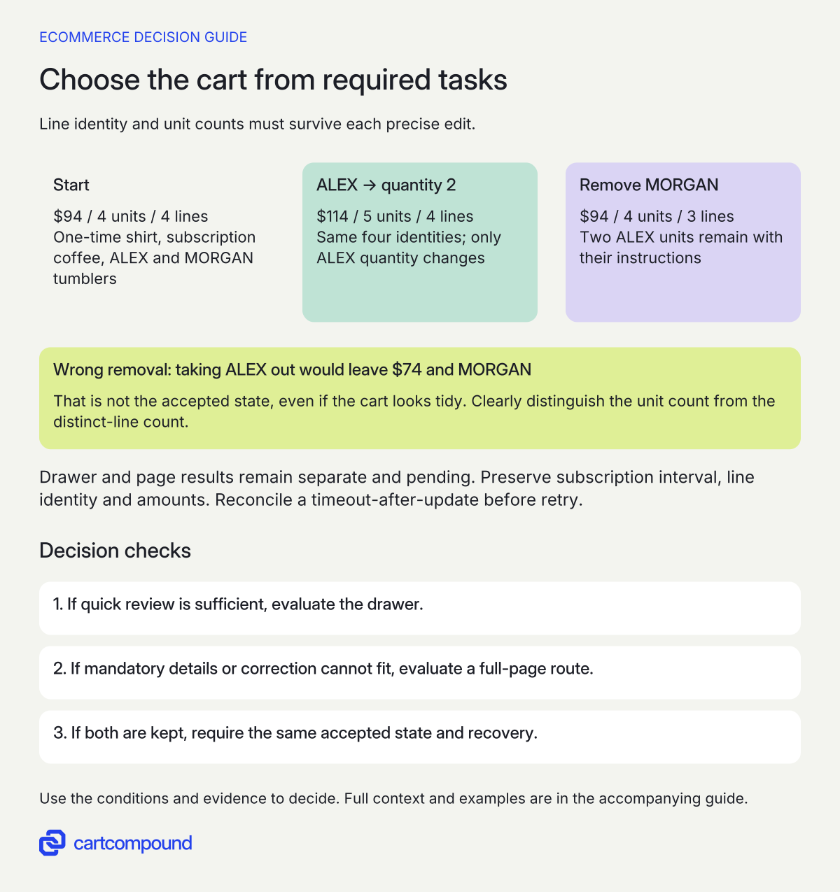
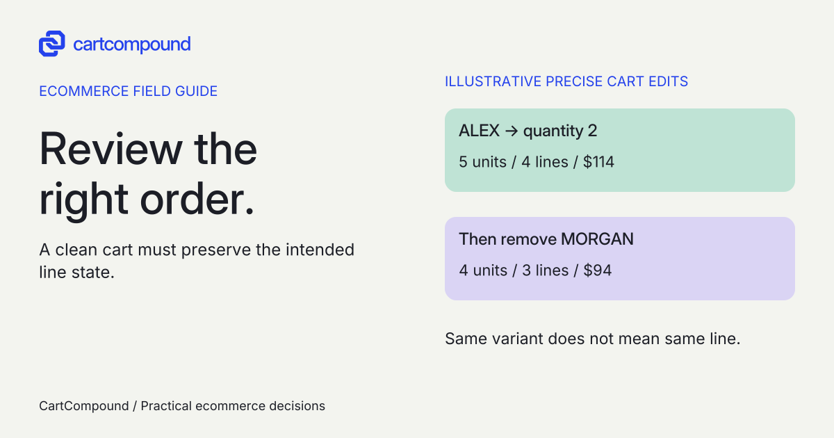
Illustrative example Increase only ALEX to quantity two: five units, four lines, $114. Then remove only MORGAN: four units, three lines, $94. Removing the two-unit ALEX line instead would leave $74 and the wrong personalization.
Illustrative merchandise amounts exclude tax, shipping and discounts. A tidy display alone does not establish correct cart behavior.
Specify pending, failed and uncertain updates
Write the behavior while a quantity change is pending. The buyer should see that the action is processing and should not be invited to submit competing edits that leave the final state unclear. Preserve the intended value and show a useful result once the current cart is known.
If stock prevents the requested quantity, identify the affected item and the supported correction. If an app or network request fails, keep the shopper’s valid information and explain what needs checking. Do not silently switch to another variant, remove personalization or drop a subscription plan to make the update succeed.
An uncertain response is different from a confirmed rejection. A timeout can occur after a cart change. The recovery needs to reconcile the actual cart before a retry so the customer does not accidentally add again. This is a requirement for the implementation owner to demonstrate, not a claim that retrying any API call is safe.
Keep shipping thresholds and promotions honest. Use the accepted cart and verified offer policy for messages. A stale progress bar should not contradict the final shipping or discount result. Detailed eligibility and stacking rules belong in their own specification; the cart’s job is to expose the actual accepted amount and relevant explanation.
Check actual modal behavior and a usable way out
First decide whether the drawer is truly modal. The W3C modal-dialog pattern expects the background to be inert, focus to enter and remain within the dialog, Escape to close, a visible close control and normally a return to the invoking element. Review the modal-dialog interaction pattern. Apply modal semantics only when actual behavior matches.
For a cart drawer, inspect what initially receives focus, how a keyboard user reads the item summaries, and where focus goes after a line disappears. A close icon that can only be reached by a mouse is not a useful escape. If the original opener no longer exists, define a logical return destination.
Do not give a nonmodal panel a modal label simply because it overlays part of the page. Document its intended interaction instead, including which outside controls remain available. Have the accessibility owner inspect the complete implementation rather than assuming an attribute makes it conformant.
Shopify’s theme guidance covers clear labels/errors, communicated changes, keyboard operation and 44-by-44-pixel primary touch targets. Check cart-relevant accessibility guidance. Inspect real mobile views, zoom, browser chrome and the on-screen keyboard. Checkout and close must remain reachable without hiding content or shrinking text to force it into a fixed height.
Score task completion before measuring business outcomes
Create a comparison sheet with task, drawer result/evidence, page result/evidence, severity and owner. Mark demonstrated, failed or not yet observed. A missing mandatory task holds the candidate; a collection of minor visual strengths must not average away a wrong-item edit or unreachable checkout.
| Scenario | Acceptance question |
|---|---|
| Two personalized copies of one variant | Can the buyer identify and change only the intended line? |
| One-time and subscription items together | Are purchase types and commitments distinguishable? |
| Bundle or kit | Can the buyer confirm contents and quantities? |
| Long labels and notes on a small screen | Can all required content reflow and be reviewed? |
| Stock/network error after edit | Can the buyer recover with an accurate final cart? |
| Direct cart visit and browser back | Does the accepted state survive the route change? |
| Keyboard open/edit/close | Is focus predictable with reachable checkout and close? |
These are proposed scenarios, not checks executed against a store. If the existing theme’s supported configuration can meet them, evaluate that before adding a new cart app. For an app or custom redesign, obtain actual implementation, license/usage, integration, accessibility, maintenance and removal costs. Include both drawer and page if both remain available.
A task test can show that a named action succeeded or failed in the tested conditions. It cannot establish a conversion uplift. If the store later has a suitable measurement setup and sufficient data for an experiment, define the outcome and guardrails in advance. Track purchase completion, order accuracy, errors and support context without treating more drawer opens as success.
Use the first stale or incorrect state to locate the defect
| Symptom | Inspect first | Required correction evidence |
|---|---|---|
| Add succeeds; badge or total stays old | Returned cart and refreshed fragments | All affected displays agree after update |
| Wrong personalized line changes | Current line identity | Only intended instructions/quantity change |
| Drawer and full page disagree | State synchronization and direct-route rendering | Same accepted basket across routes |
| Buyer cannot close or reach checkout | Modal behavior, focus, viewport and scroll | Keyboard/mobile task completes |
| Error appears but retry duplicates an item | Actual accepted cart after uncertain response | Reconciled state before next action |
Your next action is to take one difficult basket and fill the task sheet for the existing cart first. Use those failures to commission a bounded change. Choose the surface after it passes the mandatory review, edit and recovery tasks, then measure the released outcome separately.
Hypothetical worked example
Fictional four-line basket: one edit, then one precise removal
All products, prices and outcomes here are illustrative acceptance inputs, not observed store results. Assume one $30 one-time shirt, one $24 subscription coffee line with its selected interval, one $20 tumbler engraved ALEX and one $20 tumbler engraved MORGAN. The tumblers share a variant but have different properties. Exclude shipping, tax and discounts for this calculation.
| Distinct line | Quantity | Merchandise amount |
|---|---|---|
| Shirt, one-time | 1 | $30 |
| Coffee, selected subscription | 1 | $24 |
| Tumbler, ALEX | 1 | $20 |
| Tumbler, MORGAN | 1 | $20 |
The initial subtotal is $30 + $24 + $20 + $20 = $94, with four units across four lines. Ask the buyer to change only ALEX to quantity two. The intended subtotal becomes $30 + $24 + (2 × $20) + $20 = $114. The cart still has four distinct lines but now five units.
Next remove the MORGAN line. The intended subtotal returns to $114 − $20 = $94, with four units across three lines: one shirt, one coffee and two ALEX tumblers. A header badge defined as unit count should show four; a distinct-line count should show three, with its meaning clear.
If the implementation removes the two-unit ALEX line instead, it produces $114 − $40 = $74 and leaves MORGAN. A visually tidy cart could therefore pass a glance while failing the actual buyer task. Compare item text, current identity and accepted amounts, not only the number of cards.
Record drawer and page results separately as pending until tested. Both must show the subscription interval and distinguish the names, preserve that state through the edit, and let a keyboard/mobile buyer close or reach checkout. Add one proposed timeout-after-update case and reconcile the actual cart before retry. If a mandatory task fails in one candidate, hold it rather than assigning a speculative conversion score.
Frequently asked questions
Is a cart drawer always better on mobile?
No universal result follows from its location. Test the real review content, edits, viewport, keyboard and error states. A drawer that passes a short basket may still need a clear full-page route for a complex order.
Does using both a drawer and page mean duplicating every feature?
Define the task each owns. A compact confirmation can lead to a detailed review page, but both must show consistent accepted state and a supported correction route. Avoid maintaining conflicting prices or commitments.
Can a successful task test prove higher conversion?
It proves the observed task outcome in the tested conditions. A business-effect claim needs a suitable measurement design and evidence; do not turn a corrected quantity control into an invented sales percentage.
Sources and further reading
- cart template
Source checked: October 31, 2026.
- Cart API reference
Source checked: October 31, 2026.
- Dialog (Modal) Pattern
Source checked: October 31, 2026.
- Accessibility best practices for Shopify themes
Source checked: October 31, 2026.

About the author
Hamid Khan
Hamid co-founded CartCompound and works with ecommerce founders on their stores and growth priorities.
Profile and guides